
Data Visualization Techniques | Histograms, Line Charts, Scatter Plots, and Applications
In today’s data-driven world, the ability to effectively communicate complex information is paramount. Enter data visualization—a powerful tool transforming raw numbers into compelling visual stories. We will explores the art and science of data visualization techniques, empowering you to unlock the full potential of your data.
Key Takeaways:
- Data visualization transforms complex information into easily digestible visual formats.
- Effective techniques enhance understanding and decision-making
- Various tools and methods cater to different data types and audiences
- Choosing the right visualization is crucial for impactful communication
Fundamentals of Data Visualization
What is data visualization?
Data visualization is the graphical representation of information and data. Using visual elements like charts, graphs, and maps, data visualization tools provide an accessible way to see and understand trends, outliers, and patterns in data.
Why is data visualization important?
The importance of data visualization lies in its ability to make complex data more accessible, understandable, and usable. It allows us to:
- Quickly identify patterns and trends
- Communicate information effectively
- Support data-driven decision-making
- Discover hidden insights
Types of data suitable for visualization
Almost any type of data can be visualized, but some common categories include:
- Numerical data (e.g., sales figures, temperatures)
- Categorical data (e.g., product types, customer segments)
- Time-series data (e.g., stock prices over time)
- Geospatial data (e.g., demographic information by region)
Common Data Visualization Techniques
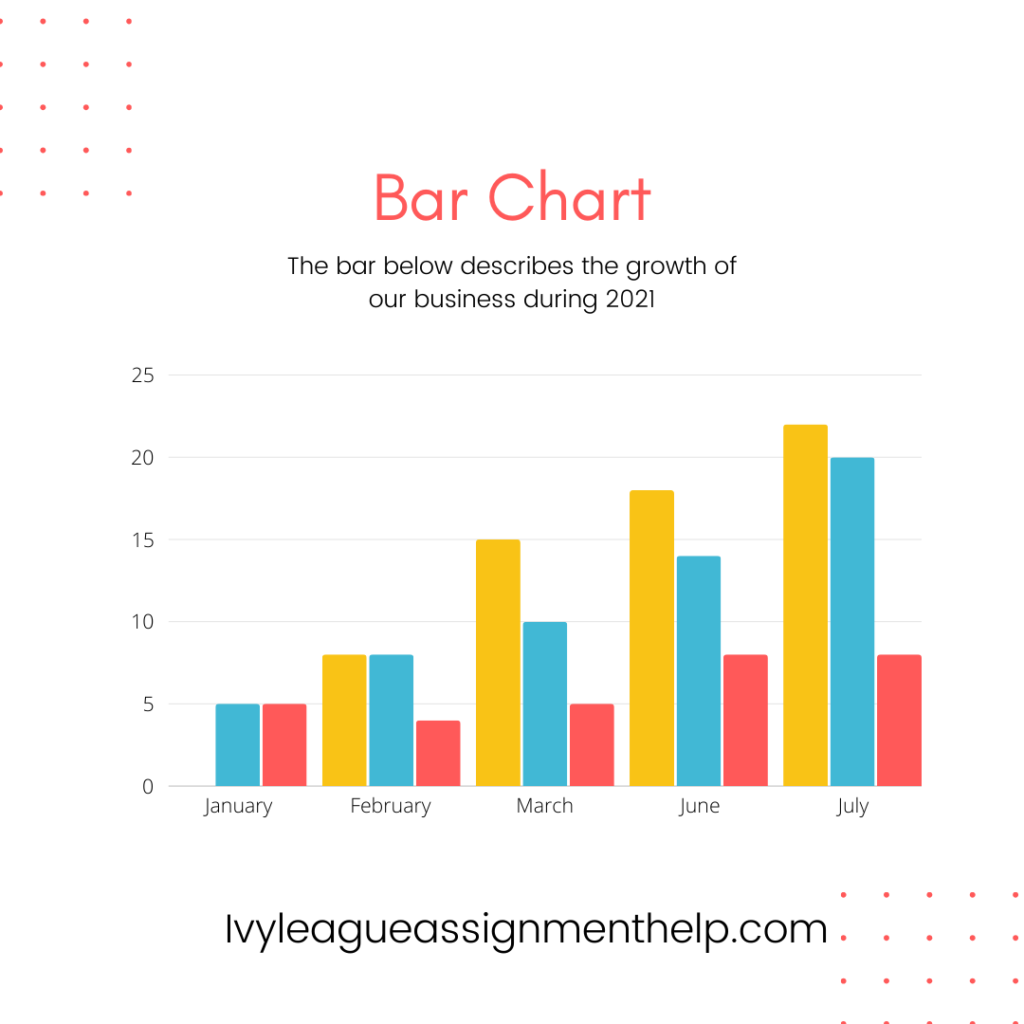
Bar Charts and Histograms
Bar charts are ideal for comparing quantities across different categories. They’re simple to understand and can effectively show the relative sizes of various items.
Histograms, on the other hand, display the distribution of numerical data. They’re particularly useful for showing the shape of a dataset’s distribution.
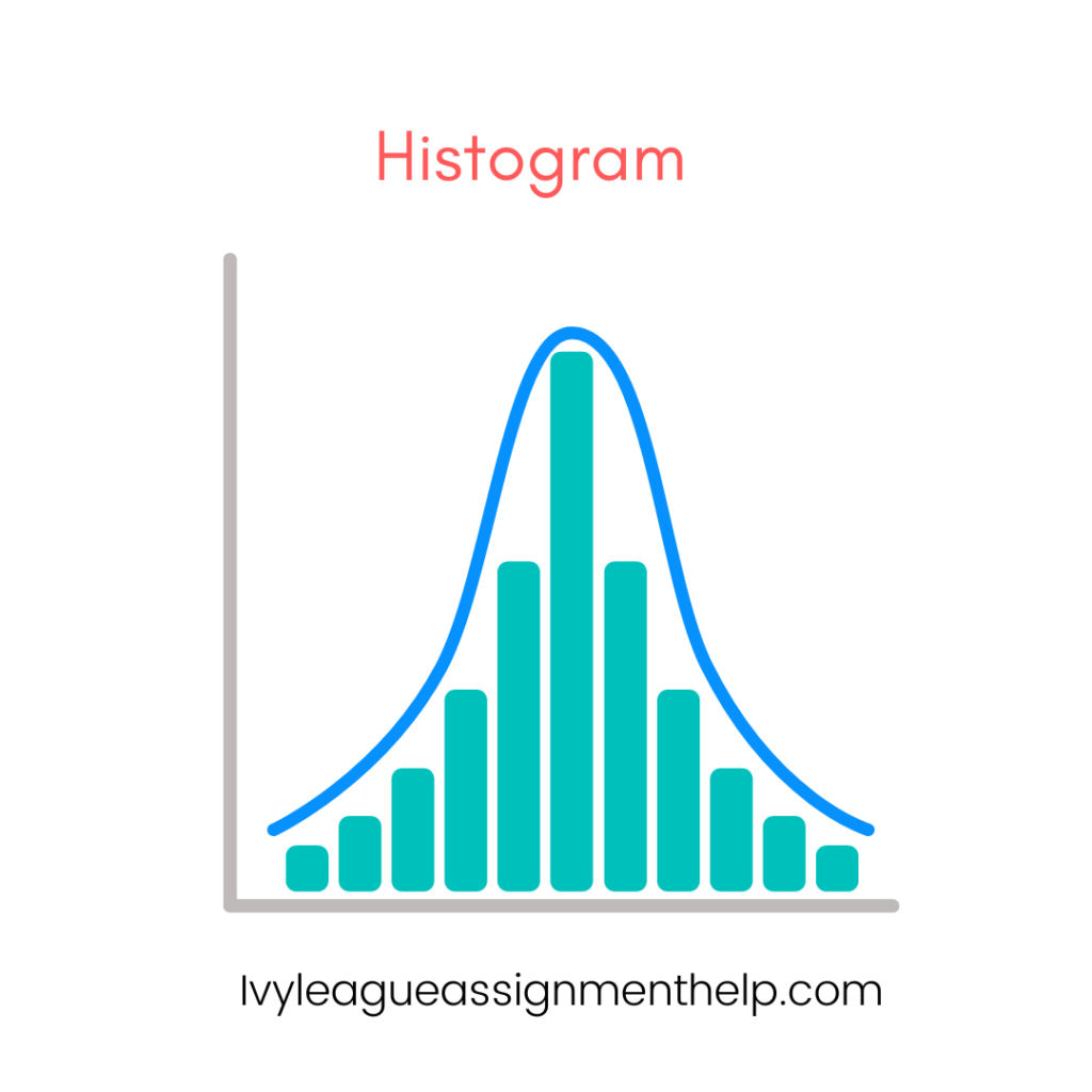
| Chart Type | Best Used For | Example Use Case |
| Bar Chart | Comparing quantities across categories | Comparing sales figures across different product lines |
| Histograms | Showing distribution of numerical data | Displaying the distribution of test scores in a class |
Line Charts and Time Series
Line charts excel at showing trends over time. They are perfect for visualizing how a variable changes over a continuous interval.
Time series charts are a specific type of line chart used to track changes over short and long periods.
Pie Charts and Donut Charts
While often overused, pie charts can be effective for showing the composition of a whole when there are relatively few categories.
Donut charts are a variation of pie charts with a hole in the center, which can be used to display additional information.
Scatter Plots and Bubble Charts
Scatter plots are excellent for showing the relationship between two variables. They can reveal correlations and outliers in your data.
Bubble charts add a third dimension to scatter plots by varying the size of the data points, allowing for the visualization of three variables simultaneously.
| Chart Type | Variables Shown | Best Used For |
| Scatter Plot | 2 | Showing correlation between two variables |
| Bubble Chart | 3 | Displaying relationships among three variables |
Advanced-Data Visualization Techniques
As data complexity increases, more sophisticated visualization techniques become necessary:
Interactive Visualizations
Interactive visualizations allow users to explore data dynamically. Tools like Tableau and D3.js enable the creation of dashboards where users can filter, zoom, and drill down into the data.
3D Visualizations
Three-dimensional visualizations can add depth to your data representation. While they can be visually striking, it’s important to use them judiciously to avoid confusion.
Network Diagrams
Network diagrams are ideal for showing connections between entities. They are commonly used in social network analysis, organizational charts, and system architecture diagrams.
Infographics
Infographics combine data visualizations with design elements to tell a story. They’re particularly effective for presenting complex information in an easily digestible format.
Dashboard Design
Dashboards bring together multiple visualizations to provide a comprehensive view of data. They’re widely used in business intelligence and performance monitoring.
Choosing the Right Visualization Technique
Selecting the appropriate visualization technique is crucial for effective data communication. Consider the following factors:
Understanding your data
- What type of data do you have? (numerical, categorical, time-series, etc.)
- What relationships or patterns are you trying to highlight?
Identifying your audience
- Who will be viewing the visualization?
- What is their level of data literacy?
- What decisions will they be making based on this information?
Determining the message you want to convey
- Are you comparing values?
- Showing composition?
- Analyzing distribution?
- Examining relationships?
By carefully considering these factors, you can choose a visualization technique that best serves your data and audience.
Tools for Data Visualization
Several powerful tools are available for creating data visualizations:
Microsoft Excel
Excel remains a popular choice for basic data visualization due to its widespread availability and ease of use.
Tableau
Tableau is a powerful data visualization tool known for its user-friendly interface and ability to handle large datasets.
Power BI
Microsoft’s Power BI offers robust business intelligence and data visualization capabilities, with strong integration with other Microsoft products.
Python libraries
For those comfortable with programming, Python libraries like Matplotlib, Seaborn, and Plotly offer extensive customization options.
R (ggplot2)
R, particularly with the ggplot2 package, is favored in academic and research settings for its statistical visualization capabilities.
| Tool | Pros | Cons |
| Excel | Widely available, easy to use | Limited advanced features |
| Tableau | User-friendly, handles large datasets | The steep learning curve for advanced features |
| Power BI | Strong Microsoft integration | The steep learning curve for advanced features |
| Python libraries | Highly customizable, free | Requires programming knowledge |
| R (ggplot2) | Powerful statistical visualizations | Steeper learning curve |
Best Practices in Data Visualization
To create effective and impactful visualizations, consider these best practices:
Simplicity and clarity
The golden rule of data visualization is to keep it simple. Edward Tufte, a pioneer in information design, introduced the concept of “data-ink ratio,” which emphasizes maximizing the ink used for presenting data while minimizing non-data ink.
- Use clean, uncluttered designs
- Remove unnecessary elements (e.g., excessive gridlines, 3D effects)
- Focus on the data, not decorative elements
Color usage and accessibility
Color is a powerful tool in data visualization, but it must be used thoughtfully:
- Use color to highlight important information.
- Ensure sufficient contrast for readability
- Consider color-blind-friendly palettes.
Labeling and annotation
Clear labels and annotations can significantly enhance the understanding of your visualizations:
- Use descriptive titles and axis labels
- Include units of measurement
- Add context through annotations where necessary
Avoiding common pitfalls
Be aware of these common mistakes in data visualization:
- Misleading scales (e.g., not starting the y-axis at zero for bar charts)
- Using pie charts for too many categories
- Overcomplicating visualizations with unnecessary dimensions
| Pitfall | Why It’s a Problem | How to Avoid |
| Misleading scales | Can exaggerate differences | Always start bar charts at zero |
| Too many pie chart slices | Difficult to compare small slices | Use bar charts for more than 5-7 categories |
| Overcomplicated 3D charts | Can distort data perception | Stick to 2D unless 3D adds real value |
Data Visualization in Different Industries
Data visualization plays a crucial role across various sectors:
Business and Finance
In the corporate world, data visualization is essential for:
- Financial reporting and analysis
- Sales and marketing performance tracking
- Supply chain optimization
Example: A treemap can effectively display hierarchical data like market capitalization across different sectors and companies.
Healthcare and Life Sciences
Visualization in healthcare helps in:
- Patient data analysis
- Epidemic tracking and prediction
- Gene expression studies
Example: Heatmaps are often used in genomics to visualize large-scale gene expression data.
Education
In education, data visualization aids in:
- Student performance tracking
- Resource allocation
- Learning analytics
Example: Line charts can show student progress over time, while scatter plots can reveal correlations between different factors affecting academic performance.
Government and Public Sector
Government agencies use data visualization for:
- Budget allocation and spending analysis
- Crime statistics and mapping
- Public health trends
Example: Choropleth maps are frequently used to display demographic data or election results across geographical regions.
Future Trends in Data Visualization
As technology evolves, so do the possibilities in data visualization:
AI-driven visualizations
Artificial Intelligence is revolutionizing data visualization by:
- Automating the process of choosing appropriate visualization types
- Generating natural language explanations of visual data
- Identifying and highlighting anomalies or patterns
Virtual and Augmented Reality
VR and AR technologies are opening new frontiers in data visualization:
- Immersive 3D visualizations of complex datasets
- Interactive data exploration in virtual environments
- Overlaying data visualizations on real-world objects
Real-time data visualization
With the rise of IoT and big data, real-time visualization is becoming increasingly important:
- Live dashboards for business metrics
- Real-time traffic and weather visualizations
- Dynamic social media trend analysis
FAQs
Here are some frequently asked questions about data visualization techniques:
What’s the difference between data visualization and data analytics?
Data visualization is about presenting data graphically, while data analytics involves the process of examining, cleaning, transforming, and modelling data to discover useful information and support decision-making.
How do I choose the right type of chart for my data?
Consider the type of data you have (categorical, numerical, time-series) and what you want to show (comparison, composition, distribution, or relationship). For example, use bar charts for comparing categories, line charts for trends over time, and scatter plots for showing relationships between variables.
What tools are best for beginners in data visualization?
Tools like Microsoft Excel, Google Charts, or Tableau Public are good starting points. They offer user-friendly interfaces and don’t require programming knowledge.
How can I make my visualizations more accessible?
Ensure sufficient colour contrast, use colour-blind-friendly palettes, provide alternative text for images, and include clear labels and legends. Consider using patterns or textures in addition to colour to differentiate data points.
What’s the role of storytelling in data visualization?
Data storytelling combines data, visuals, and narrative to convey insights more effectively. It helps contextualize data, making it more relatable and memorable for the audience.
How can I avoid misleading with my data visualizations?
Always accurately represent data, use appropriate scales, avoid cherry-picking, and provide context. Be transparent about data sources and any limitations or assumptions in your visualization.
What are some common mistakes in data visualization?
Common mistakes include using the wrong chart type, cluttering visualizations with unnecessary elements, using misleading scales, and choosing inappropriate color schemes.
